Fuze
Responsive Redesign
The problem
One of the things we wanted to address with the visual design update was the lack of responsive behavior in our Desktop client. It had a very high minimum width (over 900px), which didn’t work for many users who had small screens and/or wanted to use our communications software alongside the many tools they used for their day-to-day job without it taking up too much space. Because it involved a fair amount of engineering effort, we weren’t able to address it during that project, but we did shift our focus to it soon afterwards.
The project
I worked with the Principal Designer for the Desktop product identify the problem areas and find ways to fit our complex software into a small form factor.
We had several considerations:
Identifying what information and actions were must-have, and which were secondary.
We didn’t want this to be binary, like a “small version” and a “large version” — we wanted it to be a smooth transition so users could use the software at whatever width fit their workspace.
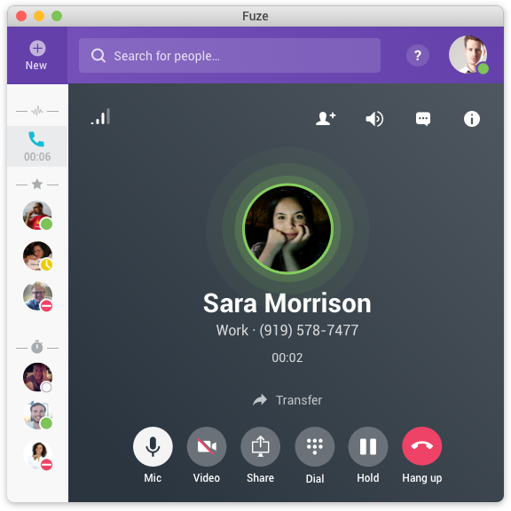
How do we handle our sidebar, which shows your chats and phone calls. It’s an important element, but takes up a lot of space. We didn’t want a manual toggle like other tools often use, because that’s too much fiddly.
The results
We ended up reducing the minimum width of the application down to 560px, almost half of what it had been before. A key element of our success was relying on overlays to show information at full size when requested, but keep it out of the way when not needed. This worked especially well with our sidebar, which would be in a small, avatar-only view by default but spring up to full size when hovered.
Note: While I was closely involved in directing and shaping the overall project and each individual design, I didn’t actually create them. They are all the work of the fantastic designer I was working with on my team.